


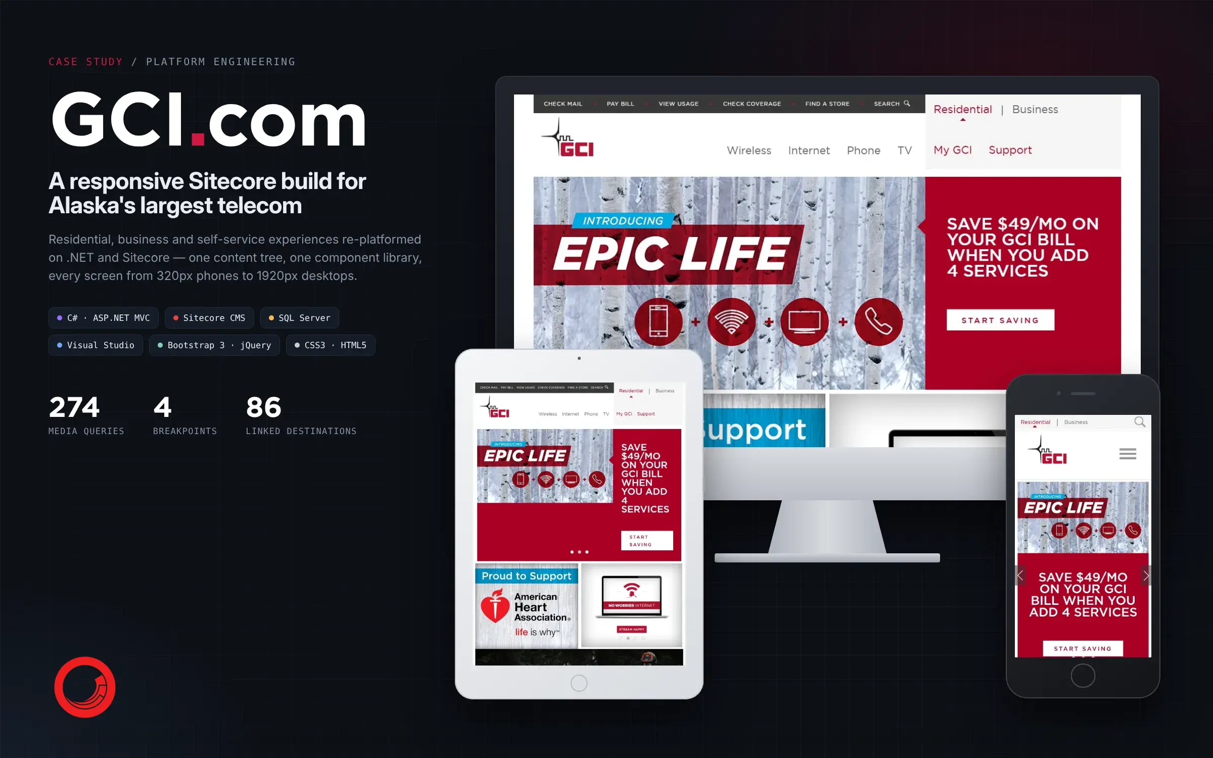
A responsive Sitecore build for Alaska’s largest telecom.
GCI serves residential, business and self-service customers across Alaska. We re-platformed GCI.com on .NET and Sitecore, so that one content tree and one component library serve every audience, from a 320px phone to a 1920px desktop.
- PLATFORM
- ASP.NET MVC, C# and Sitecore CMS on SQL Server
- SCOPE
- Residential and business sites, wireless, internet, TV, device catalog, campaign pages
- SCREENS
- Phones from 320px to desktops at 1920px
CHAPTER 01 OF 04
One platform, two audiences
Residential and business customers, one content tree, one component library and one codebase from a 320px phone to a 1920px desktop.
- CONTENT TREE
- 1
- AUDIENCES
- 2
- LAYOUTS
- 4
- CUSTOM MEDIA QUERIES
- 274
01 · PLATFORM ENGINEERING
One platform for every GCI customer
Residential, business and self-service experiences were re-platformed onto .NET and Sitecore, with one content tree and one component library. Phone, tablet and desktop layouts come from the same build, so the offers, the plans and the self-service tools stay consistent across the site.
- SITECORE
- ASP.NET MVC
- 320PX TO 1920PX
09 · BUSINESS SITE
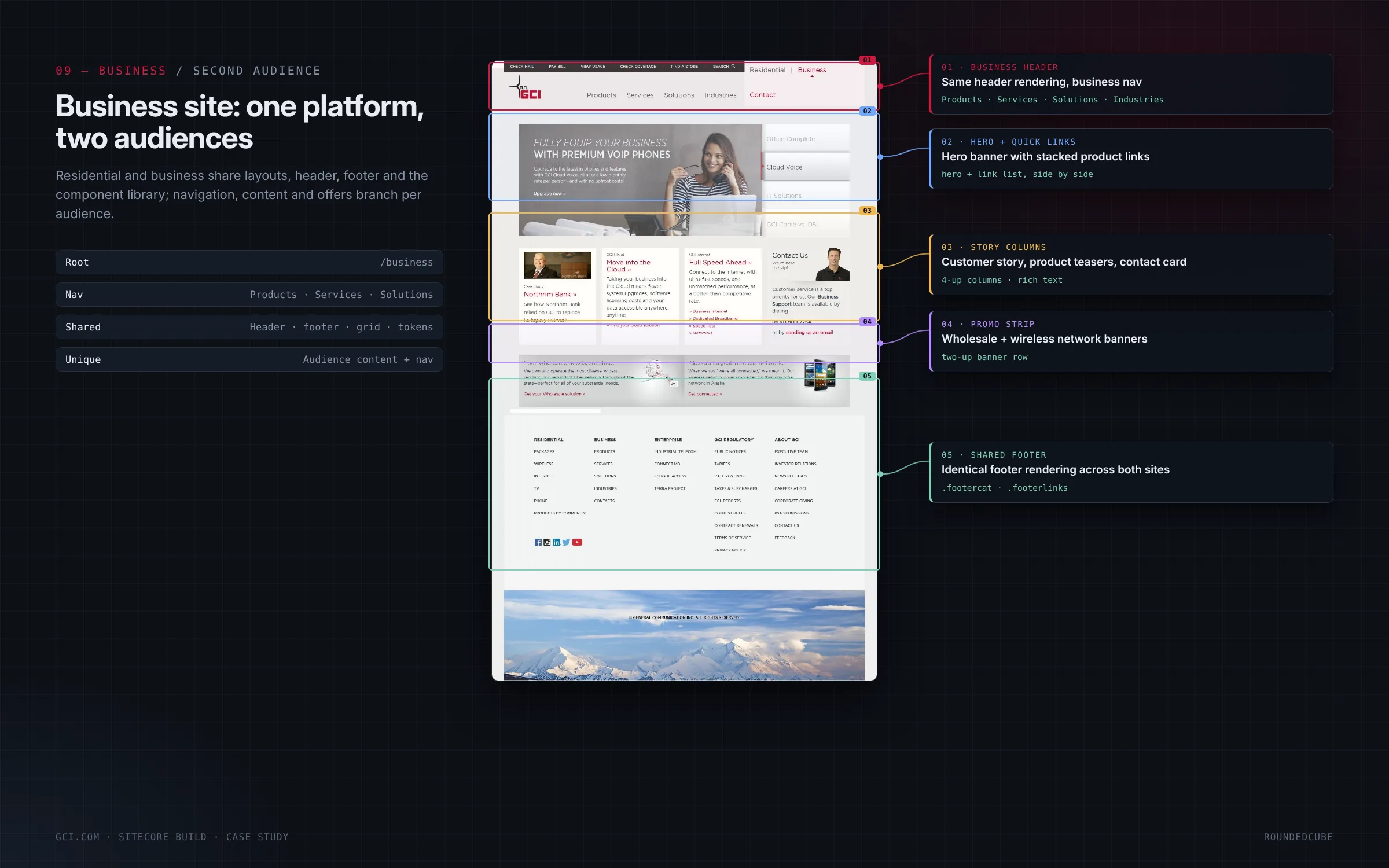
One platform, two audiences
The business site shares its header, footer, grid and tokens with the residential site, and has its own navigation (Products, Services, Solutions and Industries) and its own content. A hero with stacked product links, customer story columns, wholesale and wireless promo strips and the same footer complete the page.
- SHARED HEADER AND FOOTER
- OWN NAVIGATION
- BUSINESS CUSTOMERS
14 · INFORMATION ARCHITECTURE
gci.com: one content tree, two audiences
The site’s pages live in a single Sitecore content tree that serves residential and business customers. The diagram shows how the tree branches into the two audiences while sharing the navigation and the components beneath them.
- CONTENT TREE
- TWO AUDIENCES
CHAPTER 02 OF 04
The same parts, re-composed
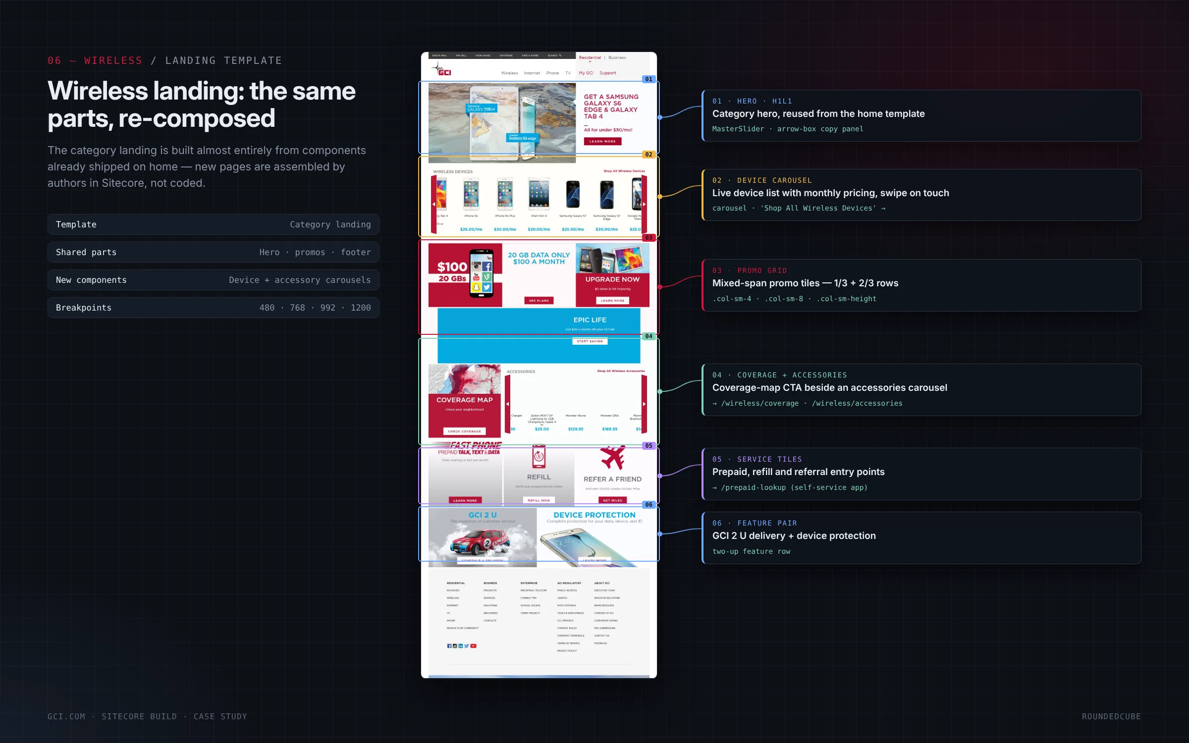
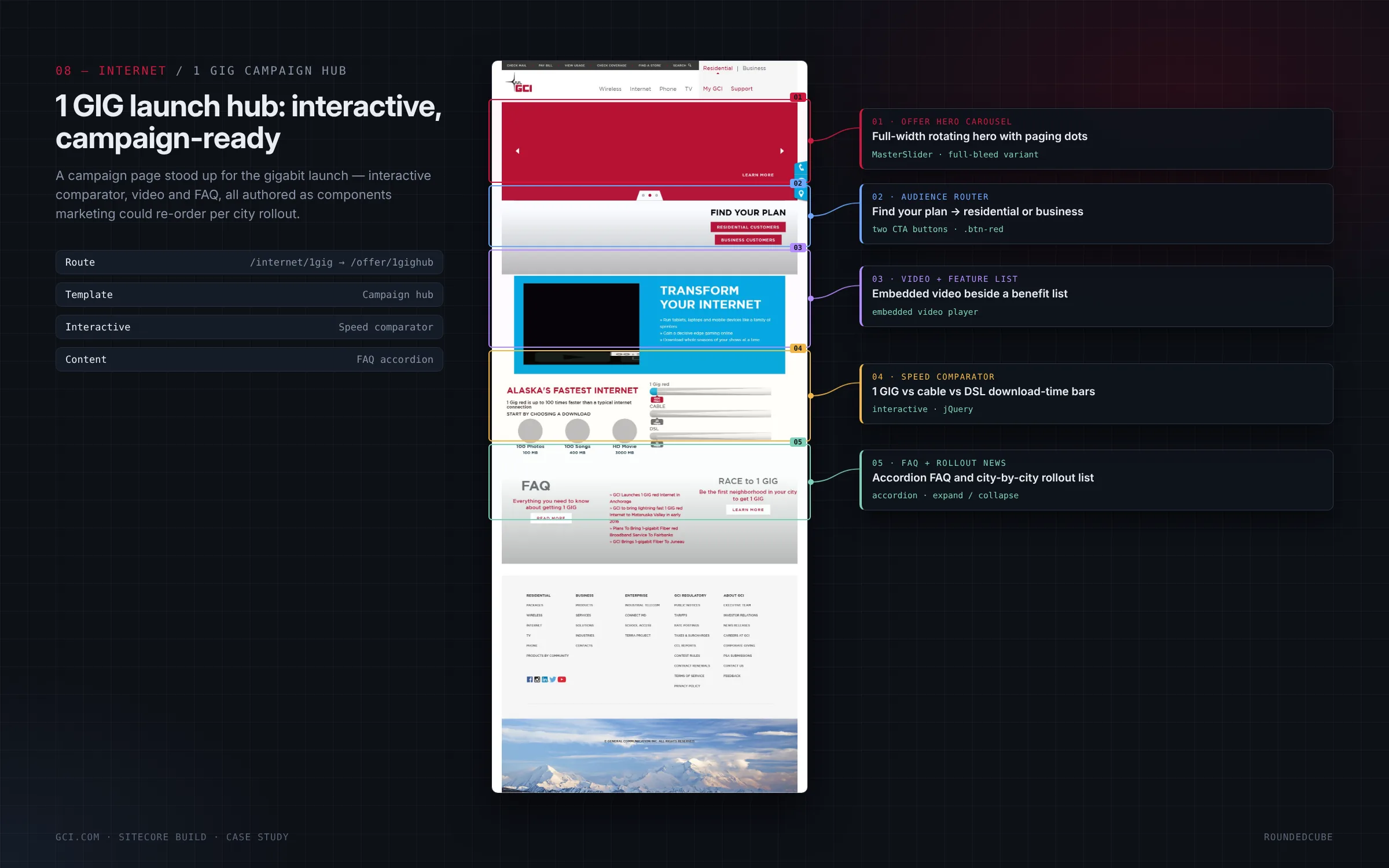
Switch between pages to see the same Sitecore renderings rearranged: the homepage, the wireless landing and a campaign stood up in the same system.
05 · COMPONENTS · HOMEPAGE
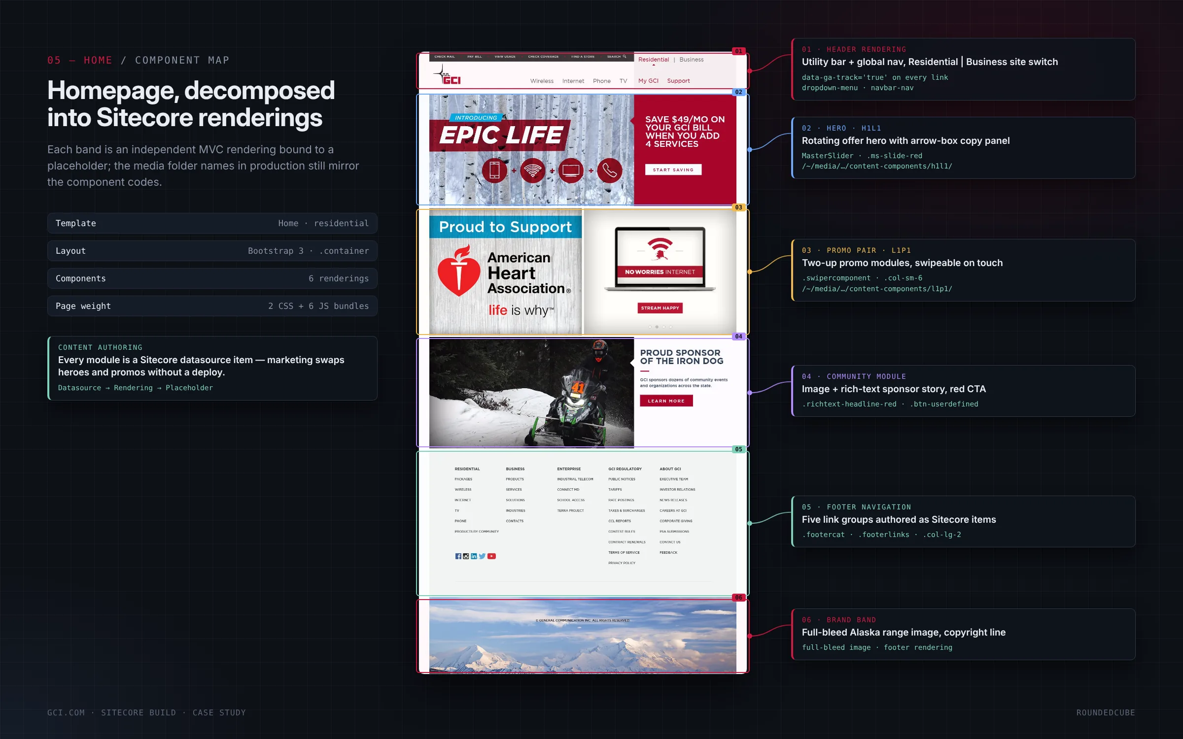
The homepage, decomposed into Sitecore renderings
Each band of the homepage is an independent rendering bound to a placeholder: the header with the Residential and Business switch, the rotating offer hero, the two-up promo pair, the community sponsor module, the footer navigation and the full-width Alaska brand band. Marketing can swap heroes and promos without a deploy, because every module is a Sitecore datasource item.
- SIX RENDERINGS
- DATASOURCE ITEMS
- NO DEPLOY NEEDED
07 · WIRELESS · DEVICE CATALOG
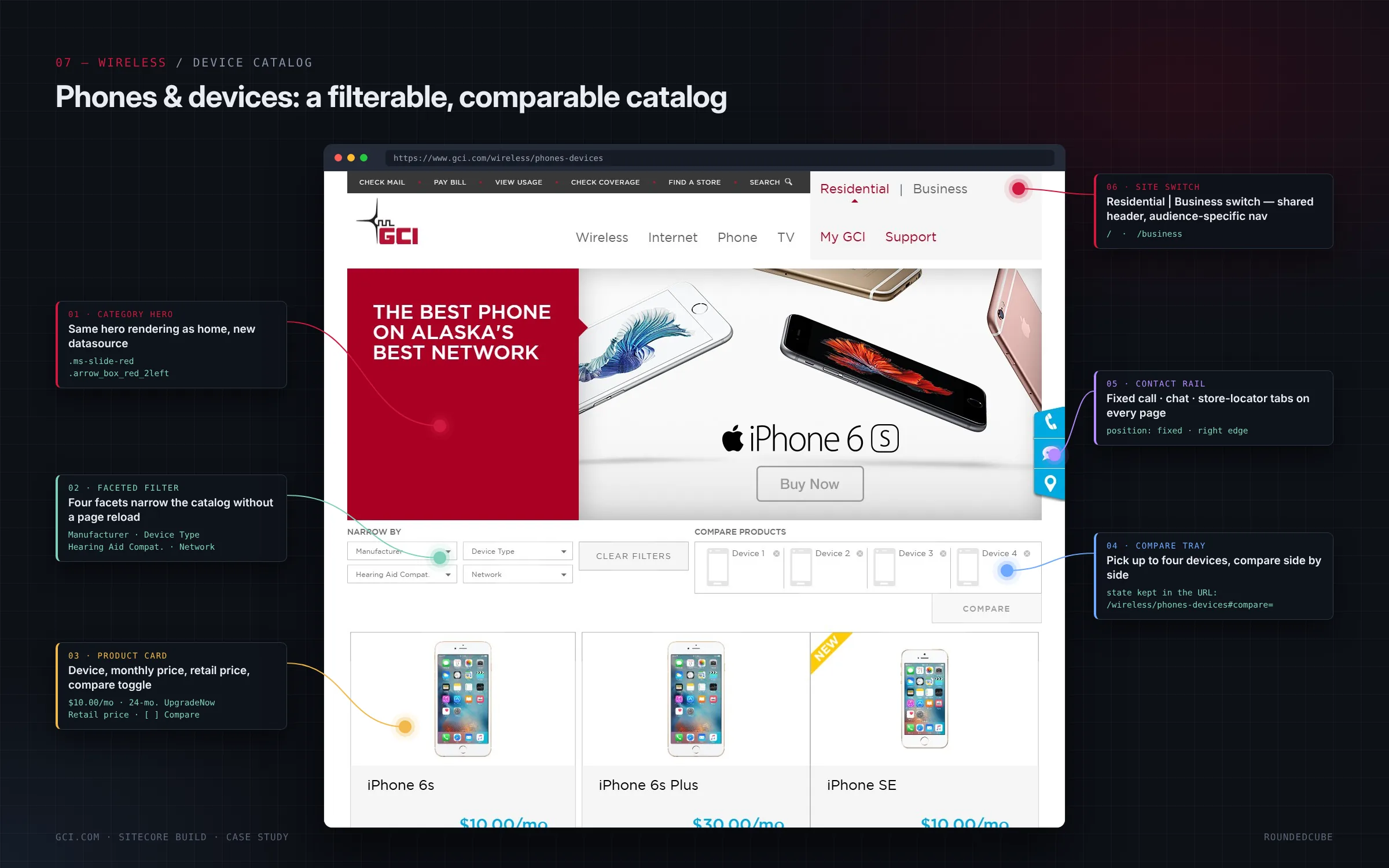
Phones and devices: a filterable, comparable catalog
Four facets (manufacturer, device type, hearing-aid compatibility and network) narrow the catalog without a page reload. Each product card shows the monthly price, the 24-month UpgradeNow terms and the retail price. Up to four devices can go into a compare tray side by side, and the comparison is kept in the URL so it can be shared. A fixed contact rail offers call, chat and store locator on every page.
- FACETED FILTERS
- COMPARE TRAY
- CONTACT RAIL
CHAPTER 03 OF 04
One codebase, four layouts
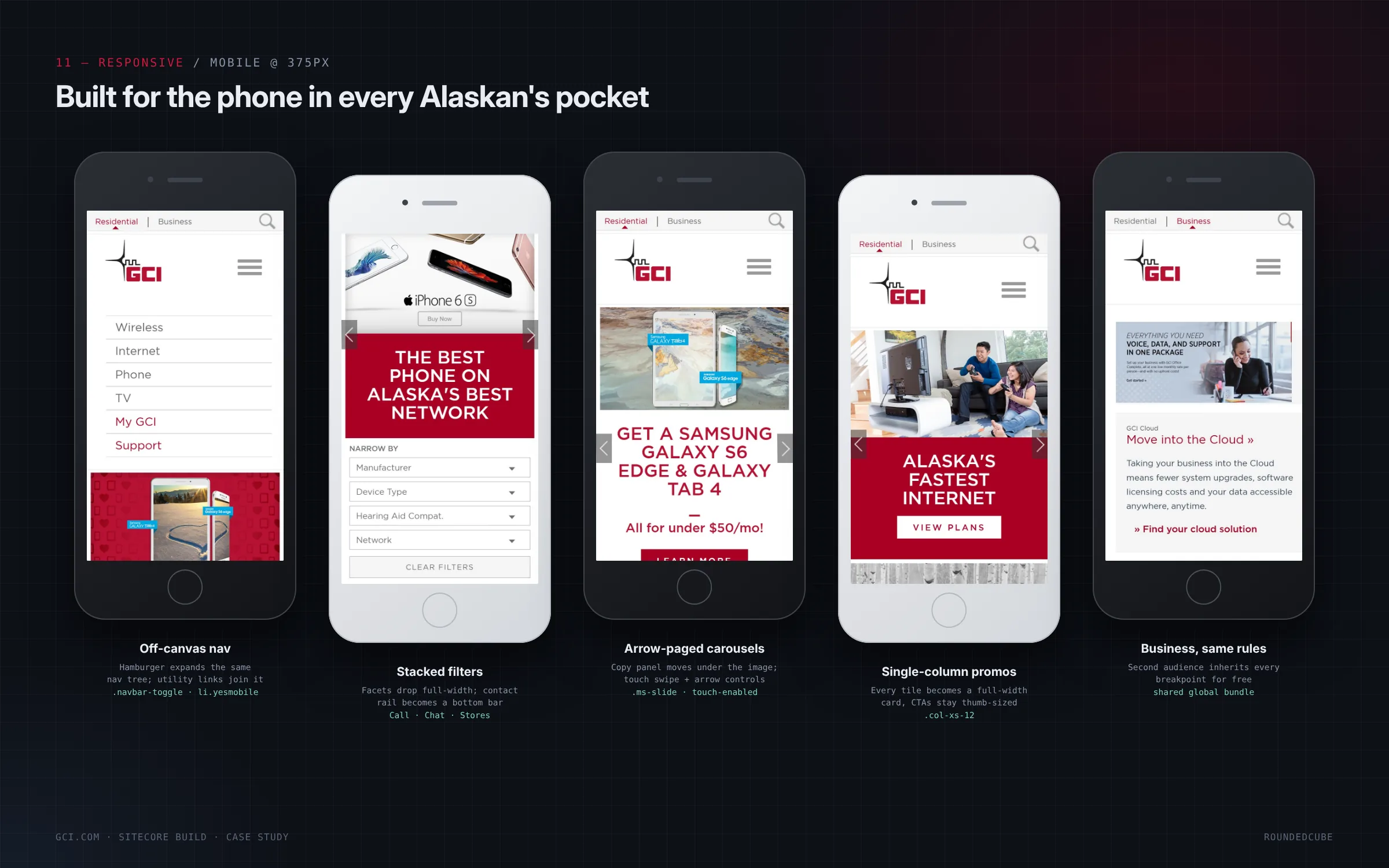
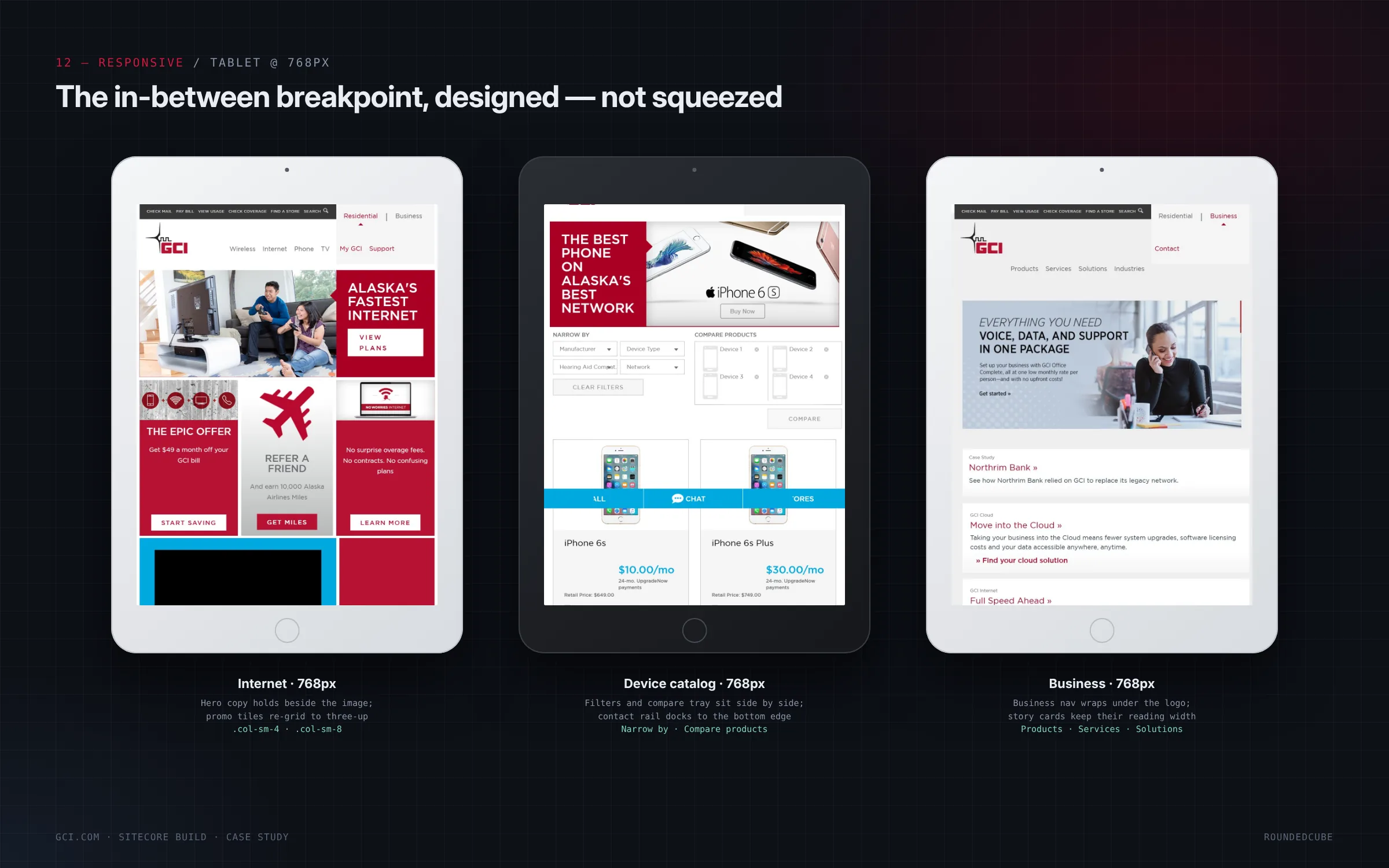
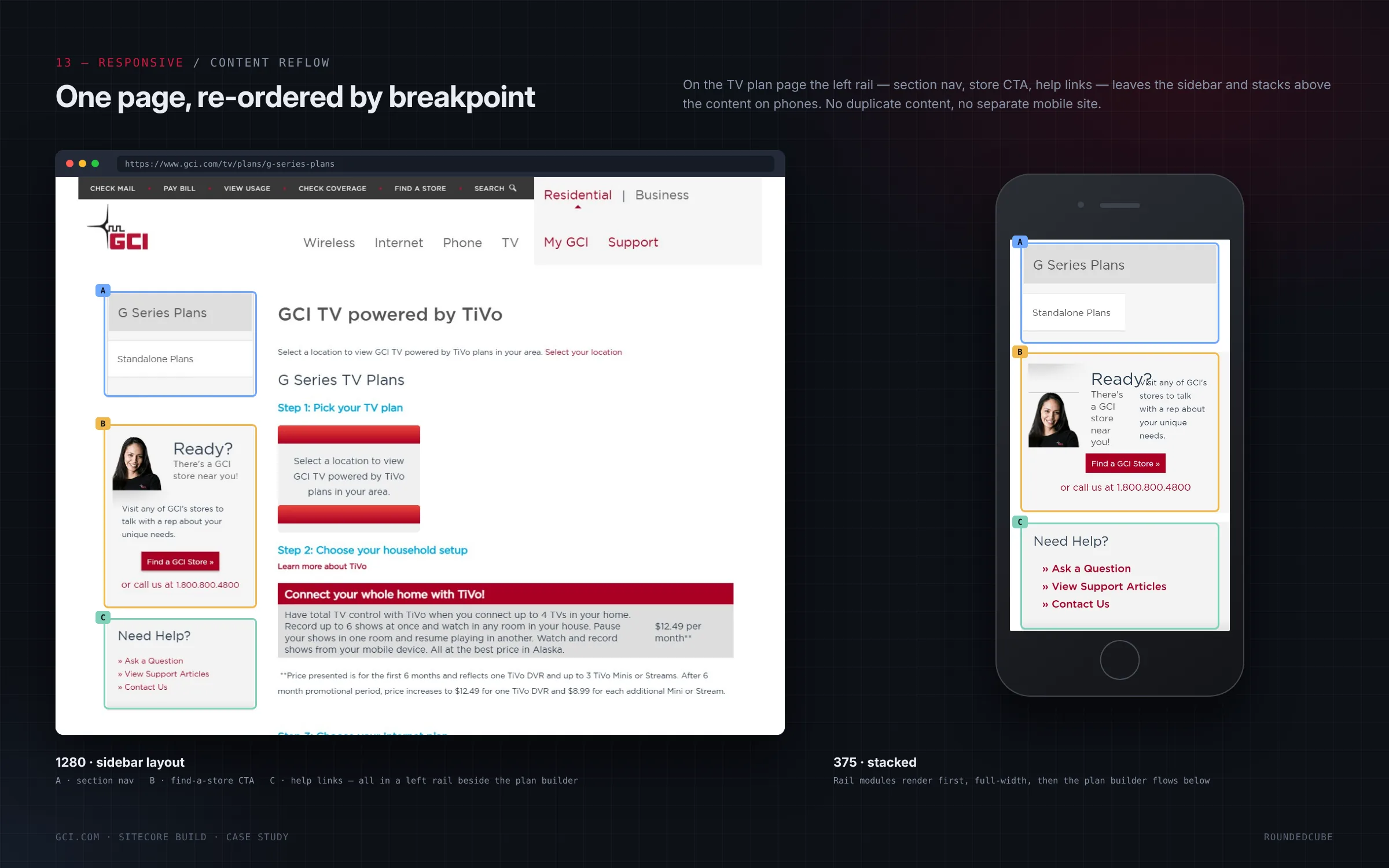
Every breakpoint was designed, not squeezed. Step through them from the breakpoint map to the phone in every Alaskan’s pocket.
10 · RESPONSIVE · BREAKPOINTS
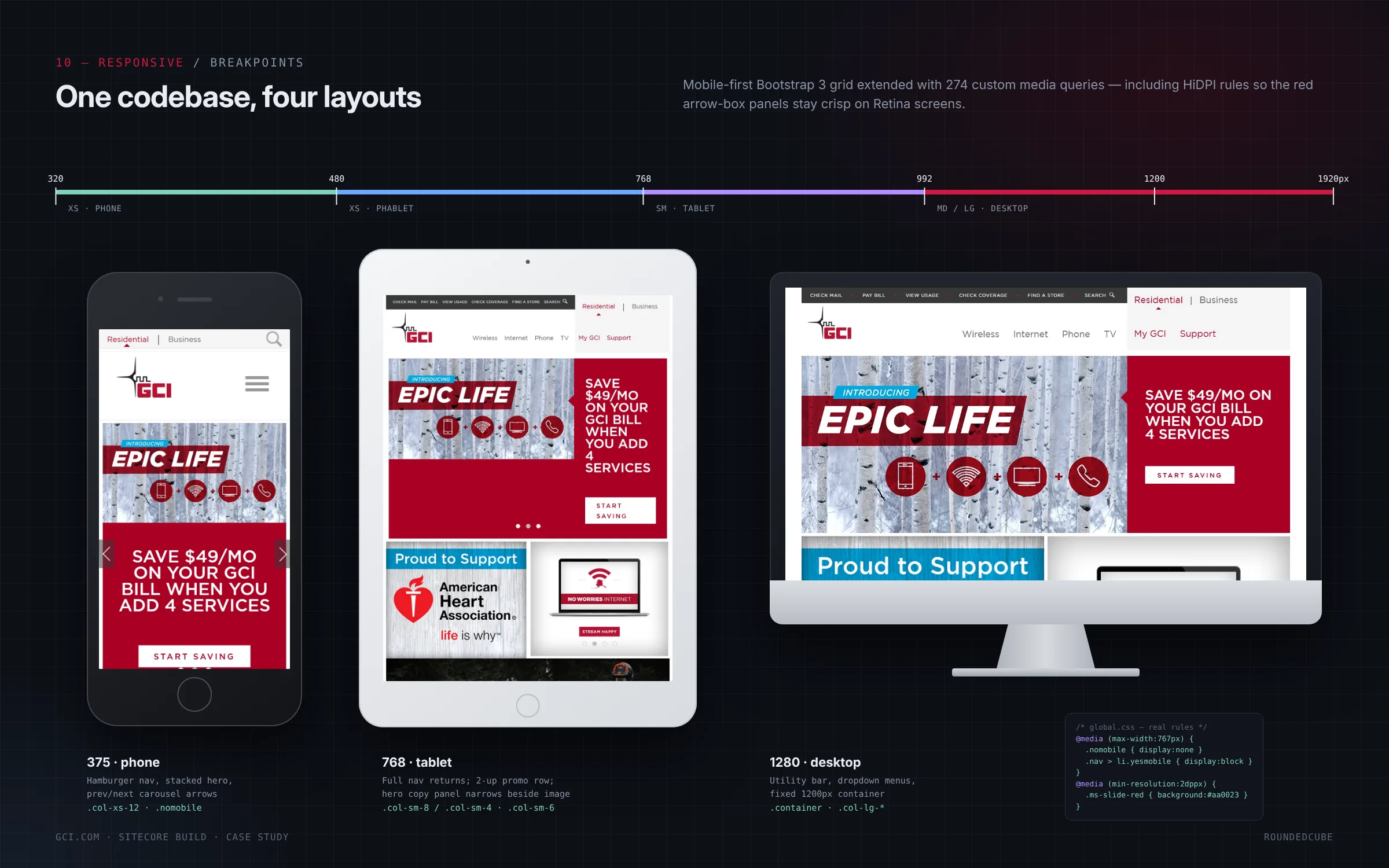
One codebase, four layouts
A mobile-first Bootstrap 3 grid, extended with 274 custom media queries. The layout changes at 320px for phones, 480px for larger phones, 768px for tablets and 1200px for desktops. High-density screens get their own rules, so the red arrow-box panels stay crisp on Retina displays.
- MOBILE FIRST
- 274 MEDIA QUERIES
- HIGH-DENSITY SCREENS
CHAPTER 04 OF 04
Built layer by layer
From the devices down to SQL Server, and from the grid up to the finished homepage.
04 · ARCHITECTURE
The stack, layer by layer
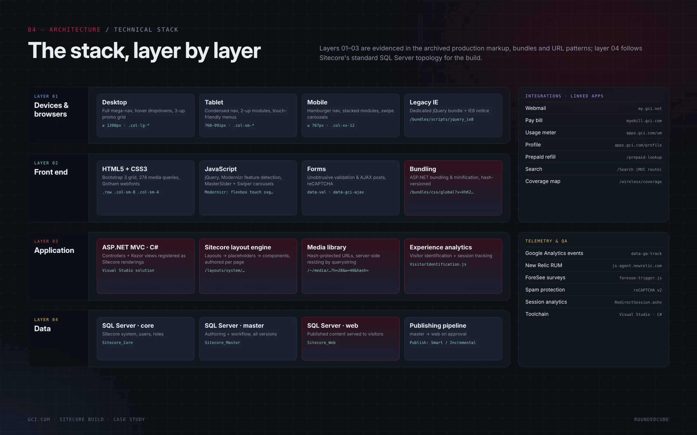
Four layers, top to bottom. Devices and browsers get a desktop, tablet and mobile experience plus a dedicated legacy bundle. The front end is a Bootstrap 3 grid with validation and AJAX forms, bundled and hash-versioned. The application layer runs ASP.NET MVC, the Sitecore layout engine, a hash-protected media library and experience analytics. Data sits in three SQL Server databases, and the publishing pipeline moves content from authoring to the live site on approval.
- BOOTSTRAP 3
- ASP.NET MVC
- SQL SERVER
15 · BUILD SEQUENCE
The homepage, built layer by layer
The homepage was built in seven steps, each one on top of the last: the grid, then the layout and placeholders, the renderings, the content, the styles, the behavior, and finally publishing. Each step can be checked on its own before the next one starts.
- SEVEN STEPS
- GRID TO PUBLISH
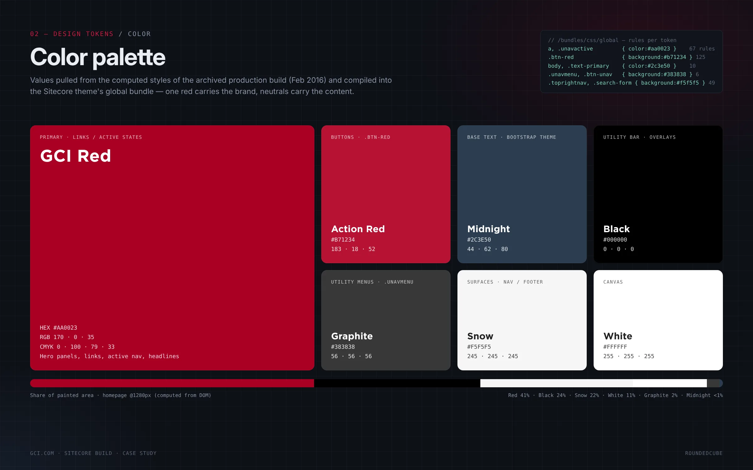
One red carries the brand, neutrals carry the content
GCI Red fills the hero panels, links and active navigation, and Action Red is kept for buttons. Midnight sets the body text, and Snow and white carry the surfaces. Measured on the homepage, red covers about 41% of the painted area and black about 24%, so the brand reads quickly without crowding the offers.
- BRAND RED
- ACTION RED
- NEUTRALS
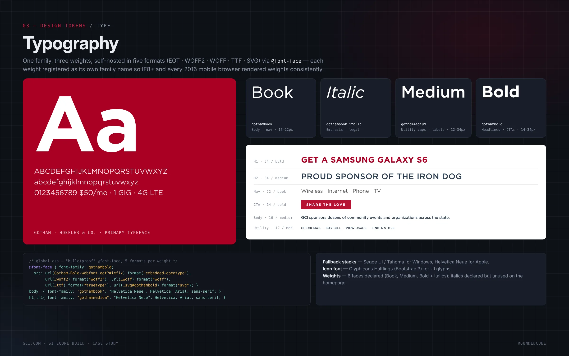
One typeface family, three weights
Gotham is the primary typeface, self-hosted in five formats so every browser renders the same weights. Book sets body copy and navigation at 16 to 22px, Medium handles labels and utility text, and Bold sets headlines and calls to action from 14 to 34px.
- GOTHAM
- SELF-HOSTED
- THREE WEIGHTS
THE OUTCOME
Every customer, every screen, one platform.
GCI.com now runs on .NET and Sitecore, with residential, business and self-service customers served from one content tree and one component library. New pages, like the 1 GIG launch hub, are composed from parts that already exist.
- SMALLEST PHONE SUPPORTED
- 320px
- WIDEST DESKTOP
- 1920px
- BUILD STEPS, LAYER BY LAYER
- 7
- FACETS IN THE DEVICE CATALOG
- 4
- 01
One tree, two audiences
Residential and business share a header, footer, grid and tokens, each with its own navigation.
- 02
Campaigns from existing parts
Landing and launch pages are assembled from renderings already built for the homepage.
- 03
Every breakpoint designed
Phones, tablets and desktops each get a layout of their own, from a mobile-first grid.
NEXT STEP
Serving customers in a hard-to-reach market?
Our Sitecore and .NET teams build sites that serve several audiences from one platform. If your customers split into groups with different offers, we can start by mapping that structure.