


A grocery website built around the weekly shop.
For Dierbergs, a St. Louis grocery chain, we built the pages that bring shoppers back each week: a feature gallery and specials, pickup and delivery, a florist storefront, department pages, a pharmacy section and promotion for the My Dierbergs app. All on Sitecore, all in Dierbergs red, black and green.
- PLATFORM
- Sitecore, with reusable components for content editors
- SCOPE
- Homepage, pickup and delivery, florist, departments, pharmacy, app promotion
- SCREENS
- Desktop, tablet and phone
AISLE 1
The weekly shop
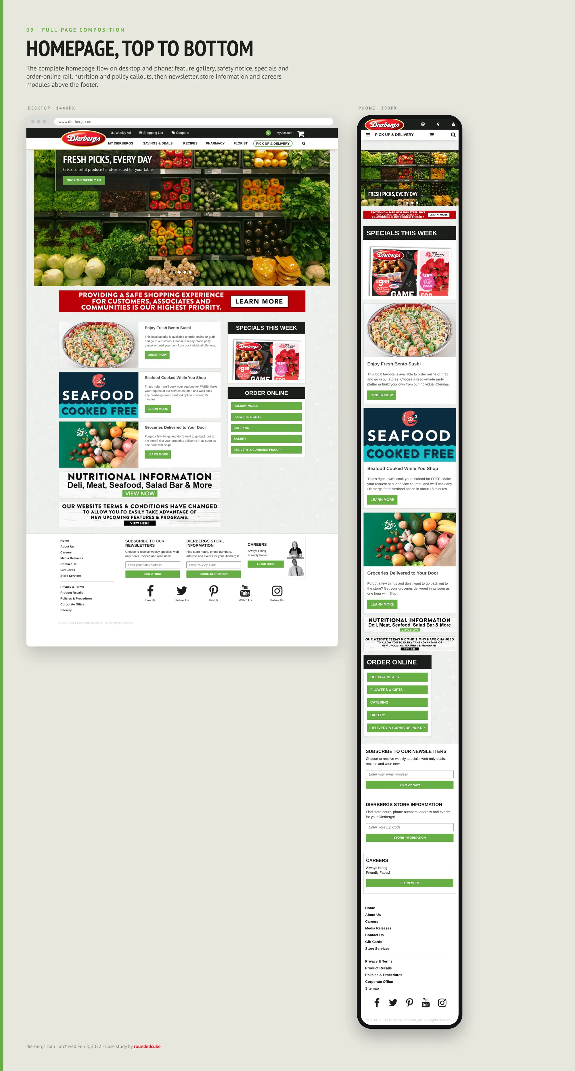
The homepage is where the week starts: the feature gallery, the specials and a quick way to order online. Scroll through it, top to bottom.
09 · FULL-PAGE COMPOSITION
The homepage, top to bottom
The complete homepage on desktop and phone, in the same order: feature gallery, safety notice, specials and order-online rail, nutrition and policy callouts, then newsletter sign-up, store information and careers above the footer.
- DESKTOP
- PHONE
01 · RESPONSIVE VIEWS
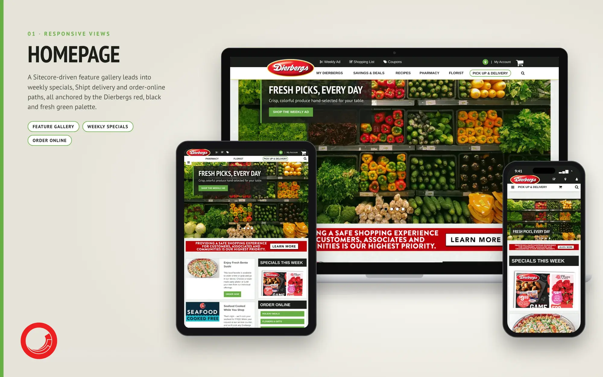
The homepage sells the week
A Sitecore feature gallery leads with fresh produce and the weekly ad, followed by a safety notice, this week’s specials and an order-online rail. On a tablet and phone the specials move into a single column, and the navigation keeps Pick Up & Delivery as a highlighted item.
- FEATURE GALLERY
- WEEKLY SPECIALS
- ORDER ONLINE
AISLE 2
Getting the order home
Pickup, same-day delivery, curbside and a florist storefront, each with its own clearly labeled way in.
02 · RESPONSIVE VIEWS
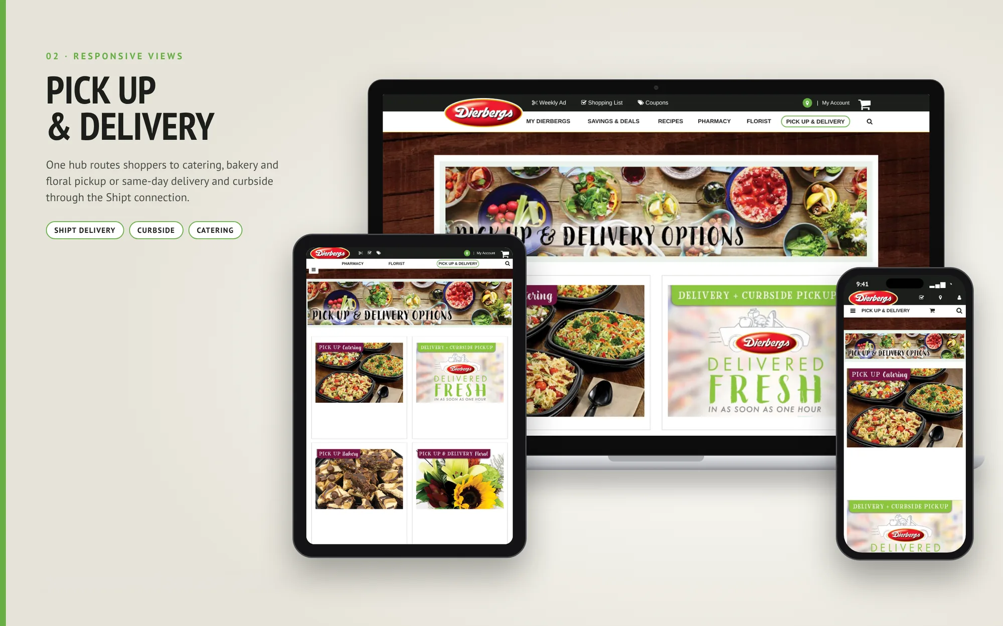
One hub for every way to get the order
Catering, bakery and floral pickup sit beside same-day delivery and curbside, all connected to Shipt. Each option has its own labeled tile, so a shopper can see at a glance what they can pick up and what can be delivered as soon as one hour.
- SHIPT DELIVERY
- CURBSIDE
- CATERING
03 · RESPONSIVE VIEWS
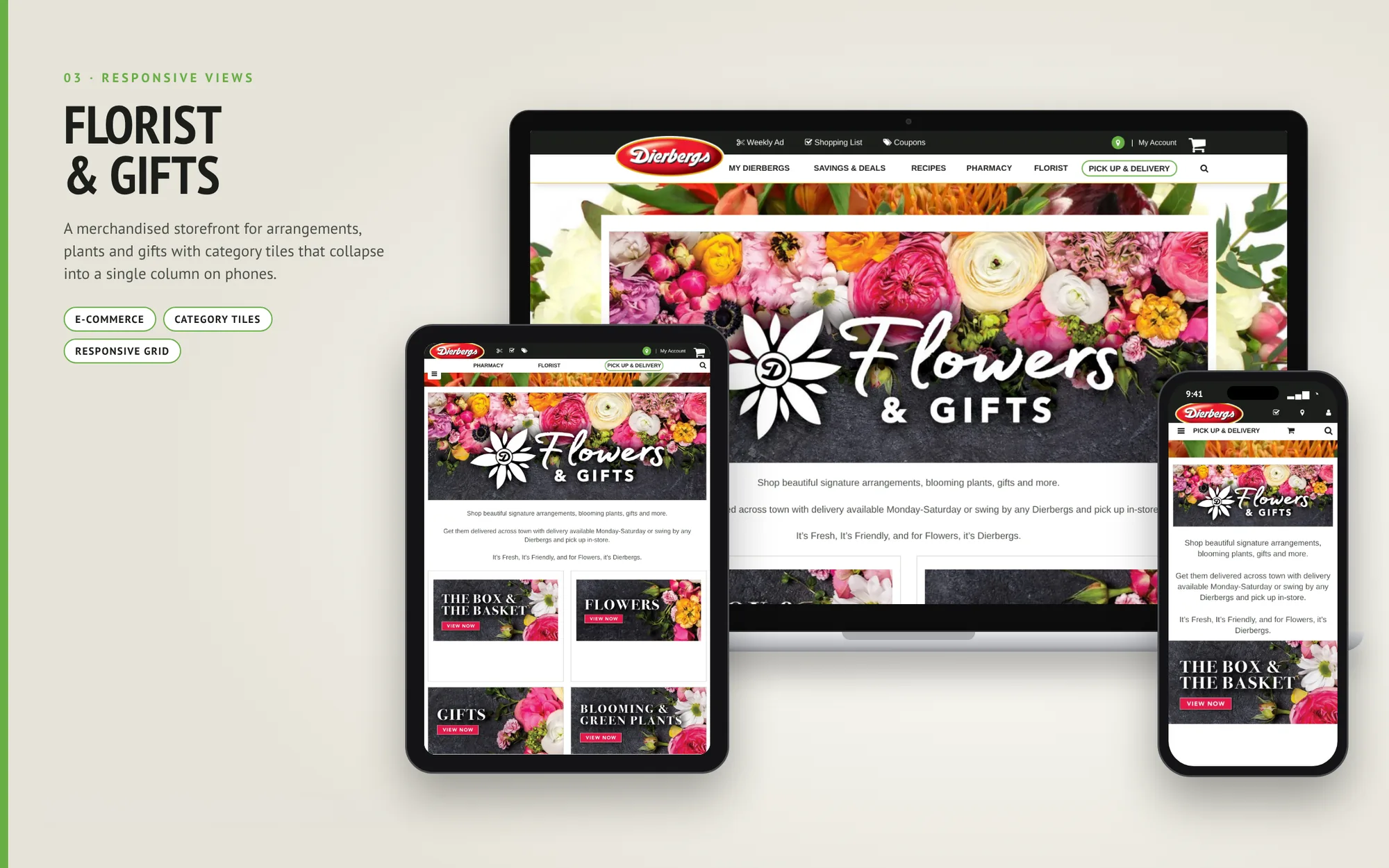
A storefront for arrangements, plants and gifts
Signature arrangements and gifts get a merchandised storefront: a large hero banner, a short note on delivery across town and category tiles for The Box & The Basket, Flowers, Gifts and Blooming & Green Plants. On a phone the tiles stack into one column.
- E-COMMERCE
- CATEGORY TILES
- RESPONSIVE GRID
AISLE 3
Departments and services
Six departments, a pharmacy and an app, each explained in plain language.
THE DEPARTMENTS
- 01Bakehouse
- 02Deli & Prepared Foods
- 03Flowers & Gifts
- 04Meat
- 05Party Center
- 06Produce
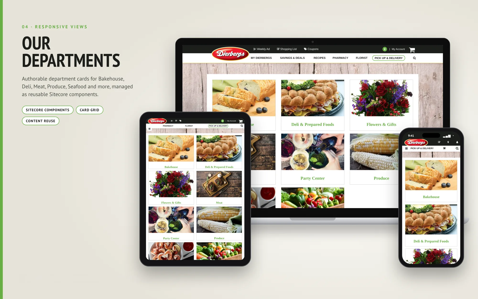
04 · RESPONSIVE VIEWS
Department pages built from one reusable card
Bakehouse, Deli & Prepared Foods, Flowers & Gifts, Meat, Party Center and Produce each get a photo card with a green label. The cards are Sitecore components: content editors change a department’s photo or name once, and the same component appears wherever it is placed.
- SITECORE COMPONENTS
- CARD GRID
- CONTENT REUSE
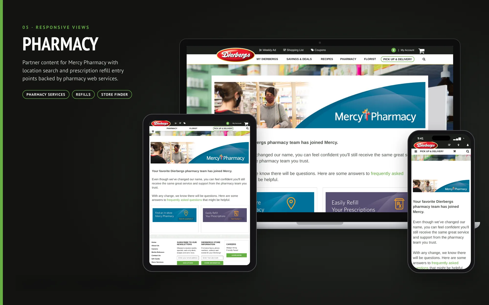
05 · RESPONSIVE VIEWS
Explaining a pharmacy change in plain language
When the Dierbergs pharmacy team joined Mercy Pharmacy, customers needed to know their pharmacists had not changed. The partner section says so directly, then gives two clear entry points: find an in-store Mercy Pharmacy and refill a prescription. Both are backed by pharmacy web services.
- PHARMACY SERVICES
- REFILLS
- STORE FINDER
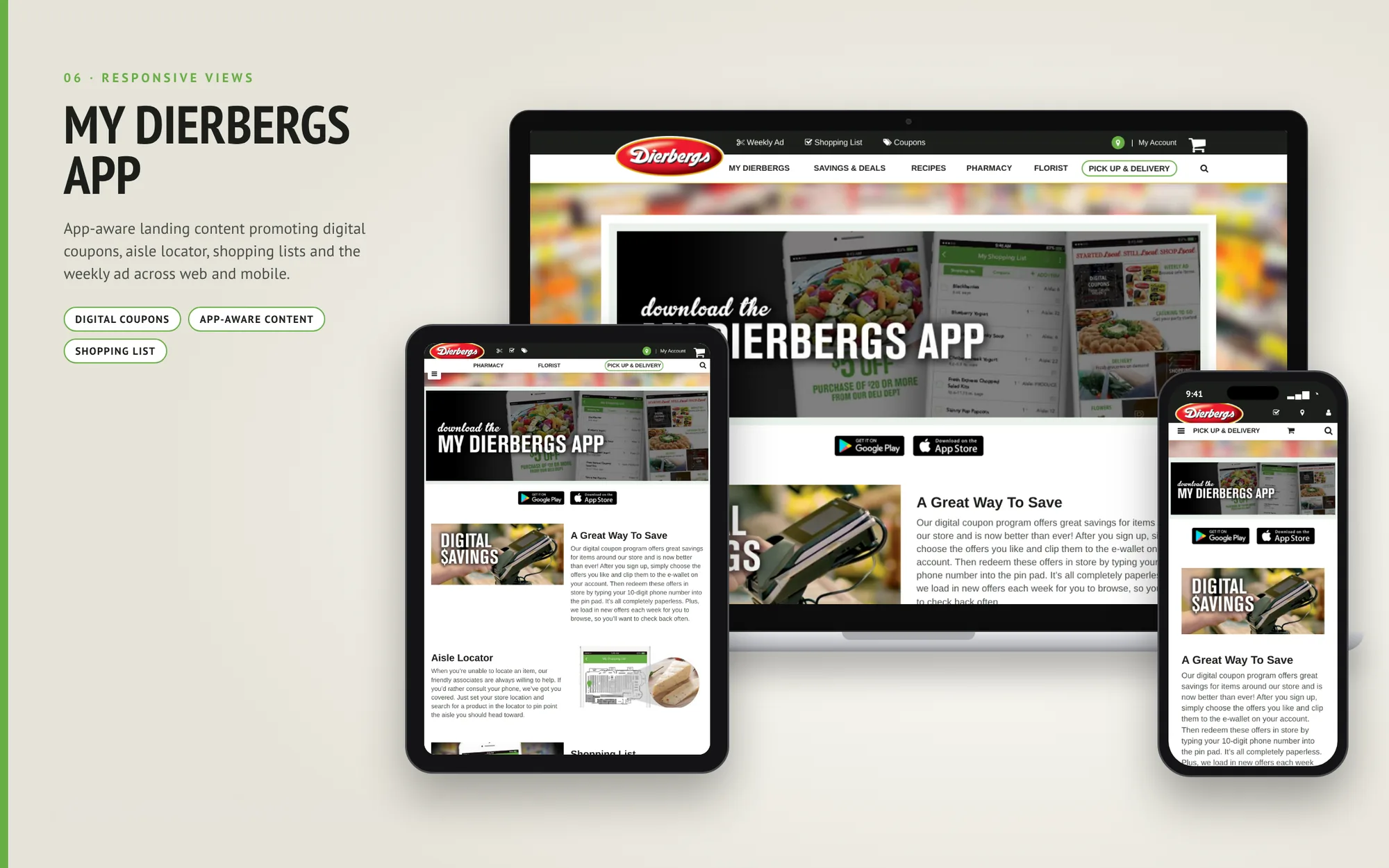
06 · RESPONSIVE VIEWS
Promoting the app where shoppers look for savings
App-aware pages promote digital coupons, the aisle locator, shopping lists and the weekly ad. Google Play and App Store badges sit under the hero, and short sections explain how digital savings work: sign up, clip offers to your e-wallet, then enter your 10-digit phone number at the pin pad.
- DIGITAL COUPONS
- APP-AWARE CONTENT
- SHOPPING LIST
THE STOCKROOM
Behind the shelves
How the site is organized, what it runs on, and the colors and type that tie it to the Dierbergs logo.
10 · INFORMATION ARCHITECTURE
Organized around how people shop
The top navigation groups the site by task: My Dierbergs, Savings & Deals and Recipes for planning ahead; Pharmacy and Florist for services; and Pick Up & Delivery for ordering. Each group has its own section, so a shopper who knows what they need can reach it quickly.
- NAVIGATION
- TASK GROUPS
11 · TECHNICAL STACK
Sitecore at the core, services around it
Sitecore manages the content, the components and the feature gallery. Shipt, the pharmacy web services and the app promotions connect as separate pieces, so each one can change without touching the rest of the site.
- SITECORE
- INTEGRATIONS

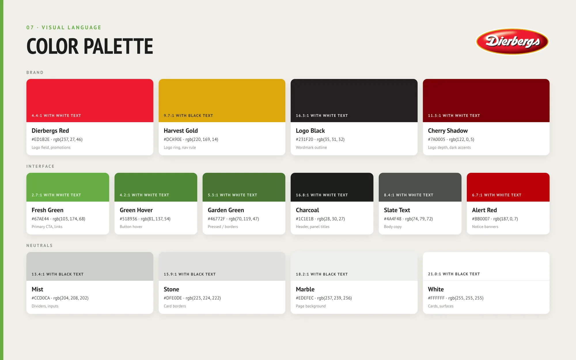
A palette pulled from the logo
The red and gold of the Dierbergs logo set the brand colors. Dierbergs red fills the logo field and promotions, Harvest gold rings the logo and marks the navigation rule, and Logo black anchors the headers. For interface work, a set of greens carries buttons, links and pressed states, with charcoal and slate for text.
- BRAND COLORS
- INTERFACE GREENS
- NEUTRALS
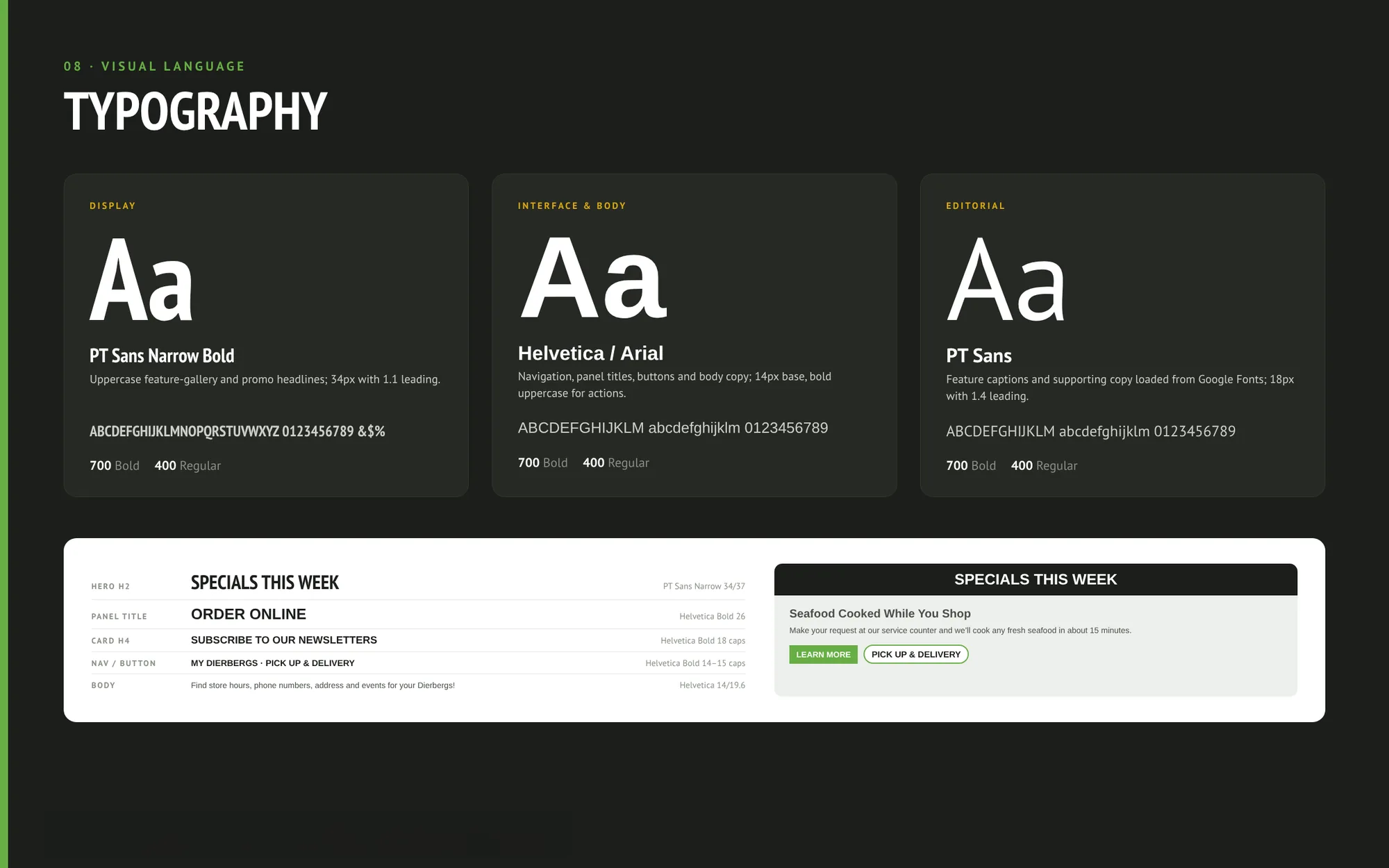
Three typefaces, one job each
PT Sans Narrow Bold sets the uppercase display headlines. Helvetica or Arial handles navigation, buttons and body copy, so shoppers meet familiar type on every page. PT Sans is kept for editorial captions and supporting copy.
- DISPLAY
- INTERFACE & BODY
- EDITORIAL
THE OUTCOME
A website shoppers come back to every week.
Dierbergs’ Sitecore site brings shoppers back for the weekly specials, gets the order home the way they want it, and explains the pharmacy and the app in plain language, all in Dierbergs red, black and green.
- DEPARTMENTS FROM ONE REUSABLE CARD
- 6
- FASTEST DELIVERY, THROUGH SHIPT
- 1 hr
- TYPEFACES, ONE JOB EACH
- 3
- 01
Organized by task
The navigation groups the site by how people shop: plan ahead, use a service, or order.
- 02
Editors in control
Department cards are Sitecore components, changed once and reused wherever they appear.
- 03
Services that can change
Shipt, the pharmacy services and the app promotions connect as separate pieces.
NEXT STEP
Working on a site like this?
We build and support Sitecore, Kentico, Umbraco and Storyblok sites. Bring us the shoppers you serve and the systems you run today, and we will sketch a build plan around them.